
Tuesday, December 5, 2017
Tuesday, November 28, 2017
10s Walking Cycle
.gif) The walk cycle
is one of the most important learning concepts in animation--and
also one of the most technically difficult, because it requires so much
attention to the movement of opposing limbs.
The walk cycle
is one of the most important learning concepts in animation--and
also one of the most technically difficult, because it requires so much
attention to the movement of opposing limbs.
However difficult, though, if you can learn to master a walk
cycle then you can animate just about anything. There are many types of
walk cycles, and you can vary the motion to match your character or
his/her mood; you can do bouncy walks, shuffling walks, casual slouches.
But the first and simplest is the standard upright walk, viewed from
the side--and that's what we're going to attack in simplified form
today.
You can cover the cycle of a full stride in 8 frames.
Here is a walking cycle Flash Tutorial.
Walking Cycle Tutorial
Here is a tutorial that criticizes the "Walking Cycle":
April Peter, Animator
She has a good argument why the walking cycle is not the best way to learn.
April offers some advice:
Never stop thinking about who your character is.
Each walk should be different to suite the weight, gait, strength, body type and attitude of the character.
After you've finished the basic structure, you don't have to keep the
keys of all the transformations on the same frames. Each separate
rotation or translation can have a different timing.
Friday, November 3, 2017
Term 1 Self-Evaluation
1/2 Way Check Point
- What have you learned in Computer Arts?
- What are you proud of/ what are your strengths?
- What have you struggled with?
- What do you do to overcome challenges?
- What mark do you think you deserve? Explain why.
- How could you improve?
- What goals do you have/ what do you want to learn in Term 2?
- What do you want to do for your self-directed assignment? Post some visual examples.
Tuesday, October 10, 2017
Finding Images
Royalty-free, or RF, refers to the right to use copyright material or intellectual property without the need to pay royalties or license fees for each use or per volume sold, or some time period of use or sales.
The "free" in royalty-free does not mean there is no cost for the license, but instead refers to being able to freely use the image without paying additional royalties. A small-business owner, for example, may opt to pay a one-time fee for RF images for his website.
Please use images that have given consent for the general public to use. Here are two sites that have royalty free images for you to use:
https://pixabay.com/
https://www.pexels.com/
Thursday, September 28, 2017
Photoshop Intro
The Toolbar
We're not going to take a look at every single tool but we are going to look at almost every one of them. While this overview will give you an idea of what each tool does, go find a photo and start playing around with it.
Move Tool (Keyboard: V)
The move tool simply lets you move objects in a given layer around the Photoshop canvas. To use it, click anywhere on the canvas and drag. As you drag, the Photoshop layer will move with your mouse.
Marquee (Keyboard: M)
The marquee lets you select part of the canvas in a specific shape. By default you get a rectangular (or perfect square if you hold down shift while selecting), but you can also select in the shape of an ellipse (or a perfect circle if you hold down shift while selecting).
Lasso (Keyboard: L)
The lasso is a free-form selection tool that lets you drag around the canvas and select anything the lasso'd area covers. Within this tool you also have access to the polygonal lasso, which lets you create a selection by clicking around on the canvas and creating points, (make sure to go back to the exact point where you began to select/or press ESC).
The magnetic lasso, which works the same as the regular lasso but attempts to detect edges for you and automatically snap to them.
Magic Wand (Keyboard: W)
Clicking an area with the magic wand will tell Photoshop to select the spot you clicked on and anything around it that's similar. This tool can be used as a crude way to remove backgrounds from photos.
Magic Wand (Keyboard: W)
Clicking an area with the magic wand will tell Photoshop to select the spot you clicked on and anything around it that's similar. This tool can be used as a crude way to remove backgrounds from photos.
Crop Tool (Keyboard: C)
The crop tool is used to (surprise!) crop your pictures. You can specify the exact size and constrain the crop tool to those proportions, or you can just crop to any size you please.
Eyedropper (Keyboard: I)
The eyedropper tool lets you click on any part of the canvas and sample the color at that exact point. The eyedropper will change your foreground color to whatever color it sampled from the canvas.
Healing Brush (Keyboard: J)
The healing brush lets you sample part of the photograph and use it to paint over another part. Once you're finished, Photoshop will examine surrounding areas and try to blend what you painted in with the rest of the picture.
Paintbrush and Pencil (Keyboard: B)
The paintbrush is a tool that emulates a paintbrush and the pencil is a tool that emulates a pencil. The paintbrush, however, can be set to many different kinds of brushes. You can paint with standard paintbrush and airbrush styles, or even paint with leaves and other shapes as well.
Clone Stamp (Keyboard: S)
Like the healing brush, the clone stamp lets you sample part of the photograph and use it to paint over another part. With the clone stamp, however, that's it. Photoshop doesn't do anything beyond painting one area over a new area. To copy an area, press "Alt" and then left click the chosen area, Then go to the part where yo
History Brush (Keyboard: Y)
The history brush lets you paint back in time. Photoshop keeps track of all the moves you make (well, 50 by default) and the history brush lets you paint the past back into the current photo. Say you brightened up the entire photo but you wanted to make a certain area look like it did before you brightened it, you can take the history brush and paint that area to bring back the previous darkness.
Eraser Tool (Keyboard: E)
The erase tool is almost identical to the paintbrush, except it erases instead of paints.
Paint Can and Gradient Tools (Keyboard: G)
The paint can tool lets you fill in a specific area with the current foreground color. The gradient tool will, by default, create a gradient that blends the foreground and background tool (though you can load and create preset gradients as well, some of which use than two colors).
Blur, Sharpen, and Smudge Tools (Keyboard: None)
All three of these tools act like paintbrushes, but each has a different impact on your picture. The blur tool will blur the area where you paint, the sharpen tool will sharpen it, and the smudge tool will smudge the area all around the canvas. The smudge tool is very useful in drawing for creating nicely blended colors or for creating wisps and smoke that you can add to your photos.
Burn, Dodge, and Sponge Tools (Keyboard: O)
The burn, dodge, and sponge tools are paintbrush-like tools that manipulate light and color intensity. The burn tool can make areas in your photo darker. The dodge tool can make them lighter. The sponge tool can saturate or desaturate color in the area you paint with it. These are all very useful tools for photo touch ups.
Pen Tool (Keyboard: P)
The pen tool is used for drawing vector graphics. It can also be used to create paths that can be used for various things that we'll discuss in a later lesson (although if you watch the video you can see a type path being created).
Type Tool (Keyboard: T)
The type tool lets you type horizontally. Tools hidden beneath the horizontal type tool will let you type vertically and also create horizontal and vertical text masks.
Path Tool (Keyboard: A)
The path tool lets you move any created paths around. It's like the move tool, but for paths.
Shape Tool (Keyboard: U)
The shape tool lets you create vector rectangles, rounded rectangles, circles, polygons, lines, and custom shapes. These tools are very useful when designing or when creating shape masks for photos.
Hand Tool (Keyboard: H)
The hand tool allows you to click and drag around the Photoshop canvas. If the entire canvas currently fits on the screen, this tool won't do anything. This tool is for easily navigating around when you're zoomed in, or a picture is simple too big to fit on the screen at 100%.
Zoom Tool (Keyboard: Z)
The zoom tool lets you zoom in and out of the Photoshop canvas by clicking on a given area. By default, the zoom tool only zooms in. To zoom out, hold down the option key and use the zoom tool as you normally would.
Color Selection Tools (Keyboard: D for defaults, X to switch foreground and background colors)
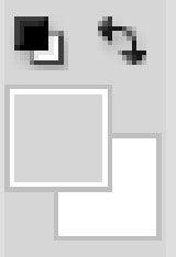
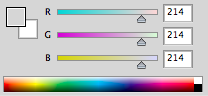
These tools let you manage the colors you're using. The color on top is the foreground color and the color in back is the background color. The foreground color is what your brushes will use. The background color is what will be used if you delete something from the background or extend it (although now, Photoshop CS5 will give you the option for using your foreground color instead in some circumstances). The two smaller icons up top are shortcut functions. The left one, showing a black square on a white square, will set your foreground and background colors to the defaults (Keyboard: D). The double-headed curved arrow will swap your foreground and background color (Keyboard: X). Clicking on either the foreground or background color will bring up a color picker so you can set them to precisely the color you want.
Palettes
Palettes are the things that you see sitting over on the right side of your screen. They make it easy for you to navigate through your document, add adjustments, switch modes, and other things.
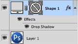
Layers
The layers palette lets you see all the layers in your document. As you start getting to know Photoshop, you'll find yourself in this palette more than any other. It'll let you organize and arrange your layers, set blending modes, set visibility and opacity of layers, group and merge layers, and a bunch of other neat things we'll learn about in future lessons.
Adjustments
Your adjustments panel is where you can easily create and edit adjustment layers. Adjustment layers are non-destructive image alterations that affect all the layers below them and can easily be turned on and off. Their most common use is for color correction (namely the Levels and Curves adjustments, but there are many different kinds of adjustments you can perform that can dramatically alter the look of your image.
Color Channels
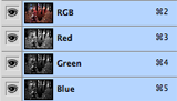
The color channels palette will let you look at the specific colors that make up your picture. If you're in RGB mode you'll get red, green, and blue. These color channels will differ if you're in a different color space (such as CMYK or LAB). When you choose a specific color, you'll notice you'll be shown your image in different versions of black and white. This is because each color channel is simply a monochromatic images representing the light in each channel (e.g. the red channel is just a look at the red light in your photo). Switching between these different channels is useful for making color channel-specific touch ups, overall contrast enhancements, and also for converting your photo to black and white in a compelling way. This will be discussed in greater detail in a later lesson about color correction and photo enhancements.
Color Picker
This palette will let you easily alter your foreground and background colors using sliders.
Color Swatches
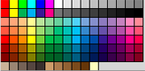
The color swatches palette is a set of pre-defined colors you can quickly choose from. You can load in several other pre-made swatch collections or create your own, too.
History
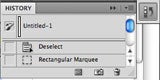
The history palette lets you go back in time to undo any previous alterations. The standard undo command (in the edit menu) will simply toggle between undoing and redoing the latest action performed on your image. The history panel is where you can go back much further (50 actions by default).
Text
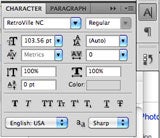
The text palette, and the paragraph palette below it, let you make all sorts of adjustments to any text you create with the type tool. These options are very similar to what you'll find in a word processing, but you can also specify things like character width and spacing which are more useful in design.
Menus
 Most of what you'll find in Photoshop's menus can be found using the previously discussed tools. Nonetheless, we're going to take a quick look at some notable items in each of the menus.
File
File, as usual, handles opening, saving, and closing operations. Towards the end of these lessons we'll be taking a look at your different saving options (namely Save for Web).
Most of what you'll find in Photoshop's menus can be found using the previously discussed tools. Nonetheless, we're going to take a quick look at some notable items in each of the menus.File
File, as usual, handles opening, saving, and closing operations. Towards the end of these lessons we'll be taking a look at your different saving options (namely Save for Web).
Edit
Edit, as usual, brings you copy, cut, and paste. In Photoshop, it's also where you transform layers and set your color spaces.
Image
Image brings you canvas and image adjustments, including destructive effects that you'll also find in your adjustments palette. Options in this menu are designed to affect the image as a whole, although many adjustments are applied to only a single layer.
Layer
Layer lets you do all of the things you can do in the layer palette with a few more options. This menu also lets you create adjustment layers and smart objects (a group of layers treated as a single object).
Select
While the marquee and lasso tools will be your main means of selecting things, the select menu can help you refine that selection or create entirely new selections based on certain criteria (such as color range and luminosity).
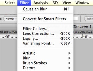
Filter
Filter brings you a wealth of built-in (and, if installed, third-party) Photoshop filters that can blur, sharpen, distort, and alter your image (or layers of the image) in many different and unique ways. The best way to get acquainted with these filters is to try them all. That can take a little time, but it's fun to play around with them and see what they do. We'll be getting into the specifics in subsequent lessons, but only looking at a few commonly useful filters.
View
View provides you with various view options, lets you hide and show line guides you've created (see video for an example), and make Photoshop snap (or not snap) to corners, edges, and to the grid on the canvas. Viewing of this invisible grid can also be turned on and off in the View menu.
Window
Window lets you hide and show certain windows and palettes. You can also arrange your Photoshop windows and palettes however you want and save them as a window preset.
That's all for today! In the next lesson we'll be learning about color correction, touch-ups, and photo enhancement.
You can contact Adam Dachis, the author of this post, at adachis@lifehacker.com.
Monday, September 11, 2017
Shape Name Design

- Open Adobe Illustrator.
- Start a new letter sized document
- Using the T [Type Tool], draw a text box and type your name with a sans serif font. All UPPER CASE.
- If your name is short, include your first and last name.
- Open the "Character" Option box.
- Highlight your name using the "T" tool.
- Explore the Text tool options. Tracking, kerning, letter height/width etc.
- Create a new layer and explore the elements of design [colour, line, shape] within your name.
- Using the Pen tool, Trace/Outline parts of the letter of your name.
- Explore the shape of the letters. De-form and re-form the letters.
- Experiment with shapes.
- Explore line, gap, and the relationships between each curve.
- Convert the solid into elemental parts.
- Play with colours, fills, and outlines.
- Have fun, be creative...
Tuesday, September 5, 2017
About Me
Write a short out line about yourself:
Introduce you-
Who are you? Where do you live/house? apartment? 2 homes? farm? Are you an international student? Do you live with a homestay family? Introduce your family. Do you have siblings? Pets?
Interests/hobbies-
What do you do in your spare time? What's your major? What do you want to do things you have yet to try...
Dream/Nightmare
Describe a dream or a nightmare that you remember. We are going to use this as inspiration for one or two assignments.
Interests In Computer Art-
What do you want to learn this semester? What experiences do you have with computers?
Post an image or drawing that represents something about you.
Wednesday, June 21, 2017
Final Self-Evaluation
- Best/favourite project of the year.
- Why?
-
Comment on your effort in working on this project.
- Least favourite project of the year.
- Why?
- Comment on your work ethic throughout the term.
- What would you like to learn/or wish you had learned in Computer Arts? OR what projects would you suggest for future classes?
Tuesday, June 13, 2017
Friday, June 9, 2017
FLASH: Bouncing Effect
Create a (Ball) Symbol
- First draw an object for Motion Tween.
- Select the object you have drawn and press F8 to convert this object to a Symbol.
- In the Symbol window which appears now. Name this object Ball_mc,
choose Movie clip behavior and bottom center square for registration.
Press OK.
Create a Motion Tween
- Double click on the Layer and type "Ball".
- Select Frame 30 and press F5 to insert a frame.
- Select any frame between Frames 2 and 14 and right click select Motion from the tween pop-up or in the menu in the Property inspector.
- Select Frame 15 and move your ball up. Hold the Shift key to move the Ball_mc in a straight line, and drag the Ball_mc up.
- Then select Frame 30 and move your ball down. Hold the Shift key to move the Ball_mc in a straight line, and drag the Ball_mc down.
- Press Ctrl+S to save your changes.
Create a Shadow with a Shape Tween
- Insert a new Layer and call it "Shadow".
- Select the first frame in the Shadow Layer, draw borderless shadow relevant to your Symbol.
- If your Color Mixture Window is not open, press Shift+F9 to open it.
- Select Eyedropper tool from your Tool box. Click
it on your shadow. Now go to Color Mixture Window and type 25%
for Alpha value.
- Select Frame 30 and press F6 to insert a keyframe, then select Frame 15 and press F6 to insert a keyframe.
- With the playhead on Frame 15, select the Free Transform tool. Slightly reduce the size of the Shadow.
- With Frame 15 still selected, select the Eyedropper tool in the toolbar, and then click on your shadow object. Now go to Color Mixture Window and change Alpha value to 10%.
- Select any frame between Frames 2 and 14 on the Shadow layer. In the Property inspector, select Shape from the Tween pop-up menu.
- Select any frame between Frames 16 and 29 on the Shadow layer. In the Property inspector, select Shape from the Tween pop-up menu.

Now its time for Final touch up
- Select Frame 1 of the Ball layer. Press F5 to add a keyframe. A new keyframe is added, and the playhead moves to Frame 2.
- Go back to frame 1, select the Free Transform tool from your toolbox.
- Select the transformation center point (the small circle near the center of the movie clip) and drag it to the bottom of the heart. On the Stage, drag the upper middle transform handle down to slightly compress the heart shape.
- Right-click Frame 1 of the heart layer and select Copy Frames from the context menu. Go to 29th frame and press F8 to insert a new keyframe. Right-click 29th frame and choose Paste Frame from the context menu.
- Click on the Stage, away from any objects. Type "28" in the Frame Rate text box of your Property inspector window.
- On the Ball layer, select any frame between Frames 2 and 14. Then in the Property inspector, in the Ease text box, type 100. Similarly select any frame between Frames 16 and 29 in the same layer, then go back to Property inspector window and type -100 in the Ease text box. Do the same thing to the Shadow layer.
Monday, June 5, 2017
Photoshop Self-Evaluation
Photoshop
Self-Evaluation
Challenge #1
- What I intended to do, [did you try a tutorial? paste the URL. write a short reflection if the tutorial was useful or not]-
- What I did-
- What I am happy with-
- How I challenged myself/what I learned-
- What I tried next-
Mark yourself on challenge, creativity, technical, follow through, and what you learned. /10
Challenge #2
- What I intended to do-
- What I did-
- What I am happy with-
- How I challenged myself/what I learned-
- What was interested to try next-
Mark yourself on challenge, creativity, technical, follow through, and what you learned. /10
Challenge #3
- What I intended to do-
- What I did-
- What I am happy with-
- How I challenged myself/what I learned-
- What I wanted to try next-
Mark yourself on challenge, creativity, technical, follow through, and what you learned. /10
Comment on your progress.
Wednesday, April 19, 2017
Photoshop Tutorials
Start to play around with Photoshop.
Learn the Tool Bar and the Options Menu at the top
Try a tutorial or two to orient your self:
https://phlearn.com/
http://lifehacker.com/5753459/learn-the-basics-of-photoshop-in-under-25-minutes
http://www.photoshopessentials.com/basics/

Learn the Tool Bar and the Options Menu at the top
Try a tutorial or two to orient your self:
https://phlearn.com/
http://lifehacker.com/5753459/learn-the-basics-of-photoshop-in-under-25-minutes
http://www.photoshopessentials.com/basics/
Wednesday, April 12, 2017
Banner
You are to create a self-portrait banner for your blog using Illustrator.
- Start a New document with the dimensions 200 x 700.
- Make at least two layers- one for your design, the other for your name.
- Experiment and play with Illustrator drawing tools: shapes, lines, colours, gradients.
- Create a simple banner that expresses something about you for your Computer Arts blog.
- Have fun, be creative, try several 5+ different arrangements of the same design.
- Post the different arrangements to your blog.
| http://thecutestblogontheblock.com |
Wednesday, April 5, 2017
Self-Portrait Font
Post your finished self portrait font to your blog. Writing your name.
Reflect on your self-portrait font. Here are some questions to guide your write-up.
Then evaluate your font. Give your self a mark for your self-portrait font based on the scale:
4. Very True, 3.True, 2. Sort of True, 1.Not Really 0. No
Do you like working with typography?
Reflect on your self-portrait font. Here are some questions to guide your write-up.
- Describe the font, what sort of personality does it have?
- How does it represent you, or what aspect of your self dopes it embody?
- How is it different from other fonts?
Then evaluate your font. Give your self a mark for your self-portrait font based on the scale:
4. Very True, 3.True, 2. Sort of True, 1.Not Really 0. No
- Font is legible can recognize/read the letter forms.
- The font spells your name.
- My glyphs have a similar/familiar resemblance- Heights: baseline, x height, bowl diameter, ascender/descender heights...
- The width/thickness of the lines are even too : stems width, ascender/descender thickness, serif thickness...
- My font design are unique to me. It's like no other.
Do you like working with typography?
Friday, March 31, 2017
Progress Check List
- About Me
- 9s- Pen Tool Tutorial/Animal Shapes
- 10s- Ribbon Banner
- Morphing Letter
- 5 Serif Fonts
- 5 Sans Serif Fonts
- 5 Decorative Fonts
- Self-Portrait Font
Monday, February 27, 2017
Creating Your Personal Font

A lot of work goes into creating a single font and we all use fonts every day for a multitude of purposes. Some are serious, some are casual, and some are just plain fun. However, for those learning about fonts, it can be quite a tedious thing because you see, fonts are made of a lot of different components that make each one unique. While a font may be “just a font” to us, it may be an intricate and detailed thing to others. Below is some basic terminology about the different aspects of a font.
One of the easiest components of a font to understand is the baseline. This is the line where almost every character sits. This line is imaginary, but you can tell where it is since that it what all the letters are sitting on. Letters such as “q” and “y” hang below this baseline, but it isn’t common for letters or words to do that. Another easier term from fonts is cap height. This is the height that capital letters hit. All of the letters hit this imaginary line and it’s another way to keep things uniform. Another imaginary line that is present in all fonts is the mean line. This is the line that shows the distinction between uppercase and lowercase letters. This is vital when it comes to creating fonts because you want to ensure that your font is easy to read and understand.
Before creating or using a font type, there are a few details that you should know. For example, a bowl is the curve that closes around the negative space in a letter which by the way is called a counter; you can find this in ” d”, “g”, and “o”. A bowl is also found in letters where there is negative space, but it isn’t closed off, such as “c”, “G”, and “u”.
As mentioned before, the baseline is the line where letters sit and a few extend past that. These are called descenders and includes the letters “q”, “y”, “j”, “p”, and “q”. In contrast, ascenders are the letters that extend up and they go past the mean line, such as “l”, “b”, “d”, “k”, and etc.
Also, you need to know that a crossbar is a line that we are all very familiar with, but most likely didn’t even know it had a name. A crossbar is the line that is in the upper case capital letters “A” and “H”. This is the line that goes horizontally to form the letters, but it can also be found in lower case letters like “f” and “t”, under the name of cross stroke. Oh, and did you also know that the dots about the letters “i” and “j” have a name? They are called tittles. Speaking of things that you may not know, if letters connect and touch one another is called ligature.
Moving forwards, strokes are the lines that make up all the letters and each stroke has its own name. To start with, the strokes that extend vertically are called stems. These are on letters such as “h”, and “l”, and are also on “w”. The strokes at the bottoms of letters are called serifs. These can typically be found on nearly every letter. It simply depends what font it is. However, serifs can be found on a majority of fonts. On the letters without serifs, they are called terminals. Many letters can also be terminals and terminals can be present when serifs are present on other letters. The strokes that extend diagonally are called legs. At times, they are also referred to as tails. This includes the letters “K”, “Q”, and “R”. The letter x gets its own terminology when it comes to fonts.
Now it is time to create your own font.
You are the Font Designer:Font related You Tube videos:
Font Design
Interview with Font Designer Steve Matteson
Some fonts to inspire:
Da Fonts
Urban Fonts
Create a font that has something about you; a self-portrait font.
- First write a few things about you maybe use your ideas from your "About Me" write-up that could inform your self-portrait font.
- Then doodle: pick up a piece of paper and a pencil and sketch out an alphabet, or doodle using Illustrator.
- We will learn more about the pen tool and the direct selection tool. Try a short "Pen" tool tutorial (see tutorials below).
- You can start by typing out your name and morph it into something that resembles you somehow. or scan your sketch and trace your font.
- Make sure your font is legible, you must be able to recognize/read the letter forms.
- Your glyphs should have a similar/familiar resemblance- baseline, stems width, bowl diameter, x height, ascender/descender heights...your font design should be unique to you. Try to create a font like no other.
- You only need to create a the letters to spell your name, but you may move on to other letters in the alphabet to. You are welcome to create a whole font family, but it is time consuming and likely we won't have enough time in class.
- Have fun!
- Once you have finished creating a font for your name, turn each letter into a symbol so you can use it for other things...
- Next create a banner with your name using your self-portrait font.
http://www.vectordiary.com/illustrator/drawing-with-pen-tool/
https://helpx.adobe.com/ca/illustrator/using/drawing-pen-pencil-or-flare.html
https://design.tutsplus.com/tutorials/illustrators-pen-tool-the-comprehensive-guide--vector-141
Thursday, February 16, 2017
Decorative Fonts
In typography, a typeface (also known as font family) is a set of one or more fonts each composed of glyphs
that share common design features. Each font of a typeface has a
specific weight, style, condensation, width, slant, italicization,
ornamentation, and designer or foundry (and formerly size, in metal
fonts). (e.i. "ITC Garamond Bold Condensed Italic" is a different font
from "ITC Garamond Condensed Italic" and "ITC Garamond Bold Condensed,"
but all are fonts within the same typeface, "ITC Garamond." However, ITC
Garamond is a different typeface than "Adobe Garamond" or "Monotype
Garamond.") There are thousands of different typefaces in existence, with new ones being developed constantly.
 Script typefaces imitate handwriting or calligraphy. They do not lend themselves to quantities of body text,
as people find them harder to read than many serif and sans-serif
typefaces; they are typically used for logos or invitations. Examples
include Coronet and Zapfino.
Script typefaces imitate handwriting or calligraphy. They do not lend themselves to quantities of body text,
as people find them harder to read than many serif and sans-serif
typefaces; they are typically used for logos or invitations. Examples
include Coronet and Zapfino.
 Ornamental (also known as novelty or sometimes display)
typefaces are used exclusively for decorative purposes, and are not
suitable for body text. They have the most distinctive designs of all
fonts, and may even incorporate pictures of objects, animals, etc. into
the character designs. They usually have very specific characteristics
(e.g., evoking the Wild West, Christmas, horror films, etc.) and hence
very limited uses..
Ornamental (also known as novelty or sometimes display)
typefaces are used exclusively for decorative purposes, and are not
suitable for body text. They have the most distinctive designs of all
fonts, and may even incorporate pictures of objects, animals, etc. into
the character designs. They usually have very specific characteristics
(e.g., evoking the Wild West, Christmas, horror films, etc.) and hence
very limited uses..
 A group of decorative typefaces, sometimes called simulation
typefaces, have been designed that represent the characters of the Roman
alphabet but evoke another writing system. This group includes typefaces designed to appear as Arabic, Chinese characters, Cyrillic, Indic scripts, Greek, Hebrew, Kana, or Thai. These are used largely for the purpose of novelty to make something appear foreign.
A group of decorative typefaces, sometimes called simulation
typefaces, have been designed that represent the characters of the Roman
alphabet but evoke another writing system. This group includes typefaces designed to appear as Arabic, Chinese characters, Cyrillic, Indic scripts, Greek, Hebrew, Kana, or Thai. These are used largely for the purpose of novelty to make something appear foreign.
 Blackletter fonts, the earliest typefaces used with the invention of the printing press, resemble the blackletter calligraphy of that time. Many people refer to them as gothic script.
 Gaelic fonts were first used for the Irish language
in 1571, and were used regularly for Irish until the early 1960s,
though they continue to be used in display type and type for signage.
Their use was effectively confined to Ireland, though Gaelic typefaces
were designed and produced in France, Belgium, and Italy. Gaelic
typefaces make use of insular
letterforms, and early fonts made use of a variety of abbreviations
deriving from the manuscript tradition. Early fonts used for the Anglo-Saxon language, also using insular letterforms, can be classified as Gaelic typefaces, distinct from Roman or Antiqua typefaces. Various forms exist, including manuscript, traditional, and modern styles, chiefly
Gaelic fonts were first used for the Irish language
in 1571, and were used regularly for Irish until the early 1960s,
though they continue to be used in display type and type for signage.
Their use was effectively confined to Ireland, though Gaelic typefaces
were designed and produced in France, Belgium, and Italy. Gaelic
typefaces make use of insular
letterforms, and early fonts made use of a variety of abbreviations
deriving from the manuscript tradition. Early fonts used for the Anglo-Saxon language, also using insular letterforms, can be classified as Gaelic typefaces, distinct from Roman or Antiqua typefaces. Various forms exist, including manuscript, traditional, and modern styles, chiefly
The art and craft of designing typefaces is called type design. Designers of typefaces are called type designers and are often employed by type foundries. In digital typography, type designers are sometimes also called font developers or font designers.
Every typeface is a collection of glyphs, each of which represents an individual letter, number, punctuation mark, or other symbol. The same glyph may be used for characters from different scripts, e.g. Roman uppercase A looks the same as Cyrillic uppercase А and Greek uppercase alpha. There are typefaces tailored for special applications, such as map-making or astrology and mathematics.
Typography Assignment 3 Find 5 examples of decorative fonts for your "Font Library"
Script typefaces

Ornamental typefaces

Mimicry typefaces
Blackletter typefaces

Gaelic typefaces

The art and craft of designing typefaces is called type design. Designers of typefaces are called type designers and are often employed by type foundries. In digital typography, type designers are sometimes also called font developers or font designers.
Every typeface is a collection of glyphs, each of which represents an individual letter, number, punctuation mark, or other symbol. The same glyph may be used for characters from different scripts, e.g. Roman uppercase A looks the same as Cyrillic uppercase А and Greek uppercase alpha. There are typefaces tailored for special applications, such as map-making or astrology and mathematics.
Typography Assignment 3 Find 5 examples of decorative fonts for your "Font Library"
- Type out the font with the title of the font, then describe the qualities of the font, identify the decorative category, and explain where it would be most useful.
- Organize each font by category, you can design your font card however you wish.
- Post to your blog.
Wednesday, February 15, 2017
Sans Serif

In print, sans-serif fonts are used for headlines rather than for body text. The conventional wisdom holds that serifs help guide the eye along the lines in large blocks of text. Sans-serifs have recently acquired considerable acceptance for body text.
Sans-serif fonts have become the most prevalent for display of text on computer screens. This is partly because interlaced screens have shown twittering on the fine details of the horizontal serifs. Additionally, on lower-resolution digital displays, fine details like serifs may disappear or appear too large.
Arial and Helvetica — these two faces are often confused, and often the subjects of mistaken identity.
HelveticaHelvetica
Designed in 1957 by Max Miedinger, Helvetica’s design is based on Akzidenz Grotesk (1896), and classified as a Grotesque or Transitional san serif face. Originally it was called Neue Haas Grotesque; in 1960 it was revised and renamed Helvetica (Latin for Switzerland “Swiss”).
Arial
Designed in 1982 by Robin Nicholas and Patricia Saunders for Monotype. It’s classified as Neo Grotesque, was originally called Sonoran San Serif, and was designed for IBM’s bitmap font laser printers. It was first supplied with Windows 3.1 (1992) and was one of the core fonts in all subsequent versions of Windows until Vista, when to all intents and purposes, it was replaced with Calibri.

If Arial is a rip-off of Helvetica, then Helvetica is a rip-off of Akzidenz Grotesk; or we could simply say that they are both rip-offs of earlier Grotesque faces.
Typography Assignment 2- Add to your "Font Library" blog post. Find 5 examples of sans serif fonts to add to your "Font Library. Name, annotate [compare and analyze the similarities and differences], then consider list 2-3 graphic designs where the font could be used [be specific]. [Due Wednesday].
Subscribe to:
Posts (Atom)